Categories
GIS

toronto’s human centre

Since it was trivial to calculate the centre of the city, I thought I’d do something a little more complex: calculate the centre of the city, weighted for population. I scraped the 2006 population data by ward from the City of Toronto: Ward Profiles pages; hooray for curl and regexes. Realising that I had no information on population distribution within wards, I made a good old engineering assumption: we could idealize the population as a point mass at the centroid of each ward, and then calculate the centre of mass by balancing moments around the X and Y axis. (I mean, c’mon – it’s the sort of thing we all think about daily … isn’t it? Guys … hello … anyone there?)

I’ll spare you the details until after the jump, but I calculate the human centre of Toronto to be at 43.717794°N, 79.390299°W – that’s in Blythwood Ravine, just south of Blythwood Road. We should have a picnic there …

Categories
GIS

oooOOOooh!

Now that’s a bit better. And I did it with only mild shapefile abuse.

You can load the DBF component of a shapefile into Openoffice Calc. Columns get given headers which describe their format. By pasting in the candidates column, adding the right column definition, and then resaving, you get a shapefile with today’s candidates as a new field.

Categories
GIS

ward maps: kinda working, sorta

Now I’ve sorted out formatting the labels and scraping the data, I should be almost ready to produce a pretty map.

Well, almost. The DBF component of a shapefile seems somewhat resistant to adding a column, and SQLite doesn’t seem very happy with its ALTER TABLE ADD COLUMN ... syntax.

As usual, I needed to create the database table from the shapefile. I’m not bothered about CRS, so I used -1.


.read init_spatialite-2.3.sql ASCII

.loadshp TCL3_ICITW Wards CP1252 -1

alter table wards add column candidates integer

I had mixed success getting data to load into this new column. So I improvised.

!!! WARNING: EGREGIOUS MISUSE OF DATA FOLLOWS !!!

(Sensitive readers are advised to look away)

There’s a seeming unused numeric column SHAPE_LEN in the table. As my new candidates column was coming up with occasional nulls, I cheated:


UPDATE Wards set shape_len=3 where scode_name="1"

UPDATE Wards set shape_len=1 where scode_name="2"

UPDATE Wards set shape_len=0 where scode_name="3"

...

UPDATE Wards set shape_len=3 where scode_name="44";

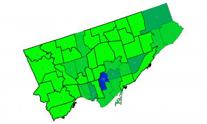
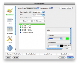
I then added SHAPE_LEN as the label, and defined a range based colour gradient for the wards in QGIS’s layer properties:

And this is how it looks:

Another partial success, as Professor Piehead would say.

Categories
GIS

closer to ward maps: scraping the data

Toronto publishes its candidates here  http://app.toronto.ca/vote2010/findByOffice.do?officeType=2&officeName=Councillor in a kind of tabular format. All I want to do is count the number of candidates per ward, remembering that some wards have no candidates yet.

Being lazy, I’d far rather have another program parse the HTML, so I work from the formatted output of W3M. It’s relatively easy to munge the output using Perl. From there, I hope to stick the additional data either into a new column in the shapefile, or use SpatiaLite. I’m undecided.

My dubious Perl script:


#!/usr/bin/perl -w
# ward_candidates - mimic mez ward map
# created by scruss on 02010/03/01
# RCS/CVS: $Id$

use strict;
my $URL =
'http://app.toronto.ca/vote2010/findByOffice.do?officeType=2&officeName=Councillor';
my $stop = 1;

my %wards;
for ( 1 .. 44 ) {
 $wards{$_} = 0;    # initialise count to zero for each ward
}

open( IN, "w3m -dump \"$URL\" |" );
while (<IN>) {
 chomp;
 s/^\s+//;
 next if (/^$/);
 $stop = 1 if (/^Withdrawn Candidate/);
 unless ( 1 == $stop ) {
 my ($ward) = /(\d+)$/;
 $wards{$ward}++;    # increment candidate for this ward
 }
 $stop = 0 if (/^City Councillor/);
}
close(IN);

foreach ( sort { $a <=> $b } ( keys(%wards) ) ) {
 printf( "%2d\t%2d\n", $_, $wards{$_} );
}

exit;

which outputs the following (header added for clarity):

Ward Candidates
==== ==========
 1     3
 2     1
 3     0
 4     0
 5     1
 6     1
 7     7
 8     3
 9     2
10     3
11     2
12     3
13     1
14     4
15     3
16     1
17     2
18     4
19     6
20     2
21     1
22     1
23     1
24     0
25     2
26     3
27    12
28     3
29     6
30     3
31     3
32     2
33     1
34     0
35     5
36     2
37     2
38     2
39     1
40     2
41     1
42     5
43     3
44     3
Categories
GIS

Labelling: harder than it looks

I’m rather taken with Mez’s rather neat Toronto ward candidate maps. I wonder if I could reproduce them (semi-)automatically?

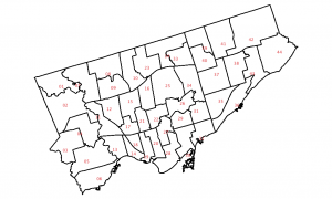
As a start, here’s the Toronto Wards layer, rendered in QGIS with the ward number as a label:

You’ll notice that something is quite off. It looks like QGIS uses the centre of the minimum bounding rectangle of a polygon as the label point. While this is okay for nice regular shapes, weird glaikit shapes end up with the label outside the boundary. Not good.

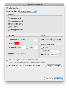
I was about to give up on this completely, when I saw QGIS’s “Labeling” [sic] plugin. What it does is work out a variety of better visual positions for your labels. Here’s the setting I chose:

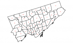
The result is much more pleasing:

Much better.