I’m rather taken with Mez’s rather neat Toronto ward candidate maps. I wonder if I could reproduce them (semi-)automatically?
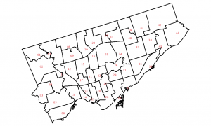
As a start, here’s the Toronto Wards layer, rendered in QGIS with the ward number as a label:
 You’ll notice that something is quite off. It looks like QGIS uses the centre of the minimum bounding rectangle of a polygon as the label point. While this is okay for nice regular shapes, weird glaikit shapes end up with the label outside the boundary. Not good.
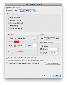
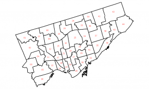
I was about to give up on this completely, when I saw QGIS’s “Labeling” [sic] plugin. What it does is work out a variety of better visual positions for your labels. Here’s the setting I chose:


One reply on “Labelling: harder than it looks”
QGIS’s labelling is much improved now, so this advice is obsolete.